Contents
- Introduction
- Summary
- Site Navigation
- The hero section
- Product Call to Actions
- Community Engagement and Newsletter Signup
Introduction
Before delving into this article, I want to clarify that I am not a Warhammer expert, nor am I antagonistic towards the franchise. My opinions are unbiased and come from my perspective as a web designer and developer.
Warhammer recently launched a new website for its brand. Even though I’m not a huge fan, I believe there are valuable lessons here for other web designers and developers.
It’s rare to see a large-scale website undergo a total redesign and domain change. The industry standard is typically a refresh every three to five years. So, it’s exciting to witness a website of this stature transition to a modern framework accompanied by fresh visuals.
For this analysis, I will primarily focus on reviewing the homepage.
Summary
The site’s visuals and product photography are excellent, which is vital for a site selling miniatures for hobbyists and collectors. The desktop version starts with an impressive video that could engage any newcomer to the franchise. However, the user experience seems to decline after this point. It’s worth noting that the site appears to be built in NextJS, which is a plus for a developer-designer like me.
The site’s navigation is unclear, and it takes too many clicks to reach the desired location. If you’re new to the franchise, it’s easy to get lost and feel overwhelmed. The layout feels generic, and more could have been done in this area, but this is a common issue in modern web design.
I did not encounter any bugs while using the site - while I may disagree with some of the UI/UX decisions, the site is well-built.
In conclusion, the site seems to struggle with balancing its purpose between selling products to existing fans and attracting new ones. I think existing Warhammer fans may find the product search experience disappointing, while newcomers might feel disoriented.
Site Navigation
The site’s navigation is clearly labeled, but it can still lead to confusion or a sense of being lost.
Secondary Navigation
The site’s secondary navigation includes links to other Warhammer-related services. These links lead to external websites with similar branding, as seen on the black bar at the top of the screenshot.
These external sites have similar navigation systems. In some cases, they lead you back to Warhammer.com, while in others, they direct you to different sites. If you choose to explore these sites, you may end up with multiple tabs open and feel disoriented. It can disrupt a user’s journey unless they know precisely what they’re looking for.
While it’s not always feasible to unify these IPs under one domain, these links, being external, are correctly set to open in new tabs. However, to minimize disruption to the user’s journey, they should ideally be relocated to the footer.
Main navigation
The main navigation of this site is clean and minimal, a design goal we should all aim for. The “Start here” link effectively guides newcomers, and the “Shop” link indicates where to purchase miniatures and other products.
However, first-time users may find it disorienting when the page navigated to after clicking “Start here” displays the same hero video as the homepage. At first glance, it seems like you haven’t left the homepage, which can be confusing.
The shop button interestingly opens a sidebar. The first link, “Get started,” directs you to the same page as “Start here.” From there, various links lead you either to a shop page for a category or another submenu to explore. This design requires many clicks to find what you’re looking for, if you know what that is!
On closer inspection, this menu is similar (but not identical) to the one that appears when you click on the burger menu icon on mobile. It’s unfortunate because the site could have benefited from a mega menu seen on many e-commerce websites.
Choosing not to use a sticky navigation bar, especially on an e-commerce site where the cart icon is positioned, is an unusual decision.
Key Takeaways from the Navigation
- Navigation labels are clear and concise.
- The hero sections of some pages look too similar to the homepage, which can cause confusion.
- The presence of external links in the secondary navigation complicates site navigation for new users.
- Users have to scroll back to the top of the site to access the navigation and cart, which is somewhat inconvenient.
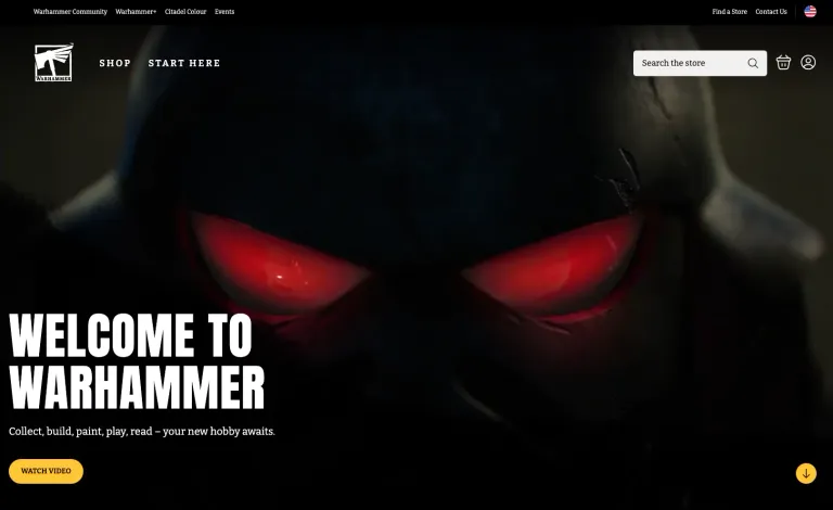
The hero section
The website’s top section starts with a full-screen video. Although visually impressive, its relevance to the site’s goal, presumably to sell products, is unclear. If viewed on a wide monitor, the video does not stretch to fill the screen, resulting in white bars on the sides. This detracts from the intended effect.
However, a noteworthy feature is the link to “watch video” at the bottom of the section. It opens a more detailed version of the video in a modal, allowing for eye-catching visuals without worrying about missing details or messages.
The site’s messaging is positive and welcoming. It clearly describes what visitors can expect:
Welcome to Warhammer - Collect, build, paint, play, read - your new hobby awaits.
This confirms my theory that the designers aimed to attract new players to the franchise. However, beyond the watch video button, there is no clear “call to action” after this message.
Key takeaways from the hero section
- While the video is impressive, it is too long, delaying users from accessing the rest of the page content. It might benefit from being shorter.
- The video doesn’t fill the screen on some monitors. This could be fixed with some CSS adjustments. Since the video has less text than its full counterpart, cropping wouldn’t result in missing details.
- The messaging is clearly targeted at newcomers, but it lacks a call to action to guide the user’s journey further.
Product Call to Actions
The product section of the site showcases significant features. It excellently guides users through the available products, offering a well-curated selection to help determine the best fit. This aspect is crucial for User Experience (UX), as it simplifies decision-making, possibly leading to increased conversion rates.
However, this valuable content is located lower on the page, potentially causing users to overlook these beneficial suggestions. Given the section’s importance, placing it higher on the page could enhance the user experience. It would also better align with the site’s goal of product promotion and sales.
New and Exclusive Section
The section titled “New and Exclusive” was particularly puzzling for me. The titles on the cards for this section are vague and do not clearly indicate what they represent. After extensive research, I was able to decipher the meaning behind these titles. It appears that this section is primarily geared towards experienced Warhammer hobbyists, who would presumably have a better understanding of these titles.
While catering to your loyal customer base is not inherently a bad thing, the rest of the homepage seems to be aimed at newcomers. This inconsistency in target audience can lead to confusion and potentially alienate new users. A more balanced approach, possibly more explicit labeling, could improve comprehension for all users.
Product Carousel
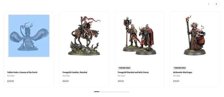
The product carousel is an interesting feature that warrants further discussion. In the current web design climate, the use of carousels is a contentious issue. They’re often seen as a stylish way to showcase a variety of content within a limited space. However, from a UX perspective, there are several drawbacks to consider.
In the case of the Warhammer site, the pagination for the slider resembles a scrollbar. This design choice led to some initial confusion, as I instinctively tried to scroll horizontally with my mouse, to no avail. This experience underscores one of the main issues with carousels: they can be unintuitive and confusing for users, which is counterproductive to a positive user experience.
Additionally, carousels often hide content from immediate view, requiring users to manually scroll through to see all available options. This can lead to some content being overlooked. They can also be distracting, with their moving elements drawing attention away from other important sections of the site.
Perhaps most importantly, carousels can pose accessibility issues. Users with certain disabilities may struggle to interact with a carousel, especially if it has an auto-forwarding feature, which can be disorienting and difficult to control.
Despite these issues, the product carousel on the Warhammer site does have one redeeming quality: convenience. If a product catches your eye, you can add it directly to your cart from the homepage. This feature simplifies the purchasing process and could potentially increase conversion rates.
Key Takeaways from the Product Call to Actions
- The product section effectively guides users through the available offerings and helps streamline decision-making.
- Unfortunately, the positioning of the product section at the bottom of the page could lead to users missing out on this valuable content.
- The “New and Exclusive” section seems primarily aimed at experienced Warhammer hobbyists, which can be confusing given the rest of the homepage’s focus on newcomers.
- The product carousel, while convenient for direct purchases, comes with several UX drawbacks, including potential confusion, hidden content, distractions, and accessibility issues.
Community Engagement and Newsletter Signup
The remainder of the homepage is largely devoted to encouraging user involvement in the Warhammer community and promoting their newsletter — a warm and welcoming approach. However, it’s unfortunate that these sections often lead users away from the main site via external links.
Community Engagement
The Warhammer website includes various sections designed to foster a sense of community among Warhammer fans. These sections effectively highlight the social aspects of the hobby, showcasing events, community posts, and hobby tips. By promoting user engagement in this way, the site helps to cultivate a vibrant and active community around the Warhammer brand.
However, these community-focused sections often direct users away from the main site to external resources. While these external sites may provide valuable content, the constant need to navigate to a new tab can disrupt the user experience. It may be more effective to incorporate more community content directly onto the main site, reducing the need for external navigation and keeping users engaged with the main site for longer.
Newsletter Signup
The newsletter signup is another prominent feature of the homepage. The newsletter is an excellent tool for keeping the community informed about the latest news and releases, and for drawing users back to the site on a regular basis. The signup process is straightforward, and the benefits of subscribing are clearly communicated, which should encourage a high signup rate.
Again, though, the newsletter signup directs users to an external page. While this may be necessary for data collection purposes, it disrupts the user’s journey and pulls them away from the main site. It could be beneficial to explore ways of integrating the signup process more seamlessly into the main site.
Key Takeaways from the Community Engagement and Newsletter Signup
- The community engagement sections effectively promote the social aspects of the Warhammer hobby, but often direct users to external sites, which can disrupt the user experience.
- The newsletter signup is a valuable tool for keeping users engaged with the Warhammer brand, but the need to navigate to an external page for signup could potentially be off-putting for some users. import type (...args) => { if (!validateArgs(args)) { throw new AstroError({ ...InvalidComponentArgs, message: InvalidComponentArgs.message(name) }); } return cb(...args); } from “astro:assets” import type (...args) => { if (!validateArgs(args)) { throw new AstroError({ ...InvalidComponentArgs, message: InvalidComponentArgs.message(name) }); } return cb(...args); } from “astro:assets”